Scrintal (Brand)
A playful, bold, and innovative brand to set the stage for Scrintal's public launch.
2022 – Today
·
Design, Branding, Identity, Copywriting

Intro
As part of leading the design processes of taking Scrintal's app from 0 → 1, I designed and developed the whole brand and visual identity too. Although I mainly focused on the product, I had to wear many different hats as a designer at Scrintal. Switching from developing a product to developing a brand identity has been one of the biggest challenges I faced. However, it also gave me the chance to evolve my skills across different fields, and transform certain design decision that we already made for the app, to a broader visual identity too.
Similar to what we did with the overall direction of our product, we aligned as a team on the value we would like to communicate through our brand identity.
As we embraced the creativity and fun in everything we do, we wanted our brand to be playful. We believed that play and easy-to-use tools amplify creativity, and we fostered a playful environment to inspire fresh ideas and innovative solutions. Secondly, our aim has always been to find new and better ways to solve problems, we wanted to encourage fresh ideas. Therefore we set innovative as another core value. Lastly, we wanted our brand to be bold, since we had the courage to break conventions and pursue bold ideas to elevate human potential.
Playful, Innovative, and Bold became our core values which guided me throughout the process of creating a brand identity.
Colors
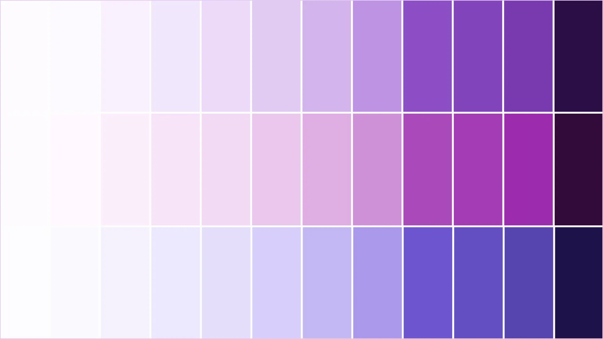
One of the first steps during my branding exploration was figuring out what our brand colors should be. This is where I transformed our core values of being playful, innovative, and bold first. During Scrintal's alpha, a dark purple tone has been the primary color in use. The whole team felt attracted to using a purple tone as the primary brand color, however we also agreed that the dark tone Scrintal was using back then almost felt mysterious, cold, and ambiguous, not really what we were after.
After some more exploration in the purple realm, I landed on a vibrant medium purple, with a slight hint of blue, similar to what you might call an amethyst or royal purple. Its richness and saturation goes well with the bold and playful core value we set ourselves. We knew that we did not reinvent the wheel there, but we found a primary brand color that conveys creativity, has enough brightness to be eye-catching without being overwhelming, works for the branding and the UI, as well as makes an excellent accent color against white or light gray backgrounds when used within web design.
Another advantage of using that color is how it pairs nicely with blue-purples and red-purples which creates a perfect base to use the brand color in vibrant and blurred gradients, creating lovely color harmonies.
Typography
A collage of historical sources, technical decisions and personal feelings. This is the best way to describe Bricolage Grotesque, traversing a complex typographical and emotional landscape by blending iconic British and French designs with modern trends and tools.
Bricolage Grotesque got designed by Mathieu Triay, a French designer and software engineer based in London. It features a contemporary and playful feel thanks to the exaggerated ink traps, the regular width version has a relaxed and confident attitude, sparks innovation, and when used in large sizes it perfectly expresses Scrintal’s boldness.


Logo & Wordmark
Designing Scrintal's new logo was a lot of fun. Early on during the drafting process, I wanted to create a shape that represents the fluidity and dynamics of Scrintal's blocks, as well as the ability to connect and dissect them. One of my first approaches was to use a stylized version of our blocks as the main element. I created some variations stacking those blocks on top of each other, slightly tilting them, and creating different iterations with different corner radius values. While I liked the direction, it was missing some sort of playfulness.
For the then following iterations, I added the concept of connecting blocks and dissecting information from documents. The whole shape immediately became more dynamic, more playful, and bold. It was a lot of trial and error to get the transition between all the paths right, but I was proud with the result.
The main versions that got used across different assets are the plain light and dark variants. However, for the usage in social media profile images, assets, and other visuals that allowed using the logo in a larger format, I created some additional assets in which I added more depth to the shape.
Assets
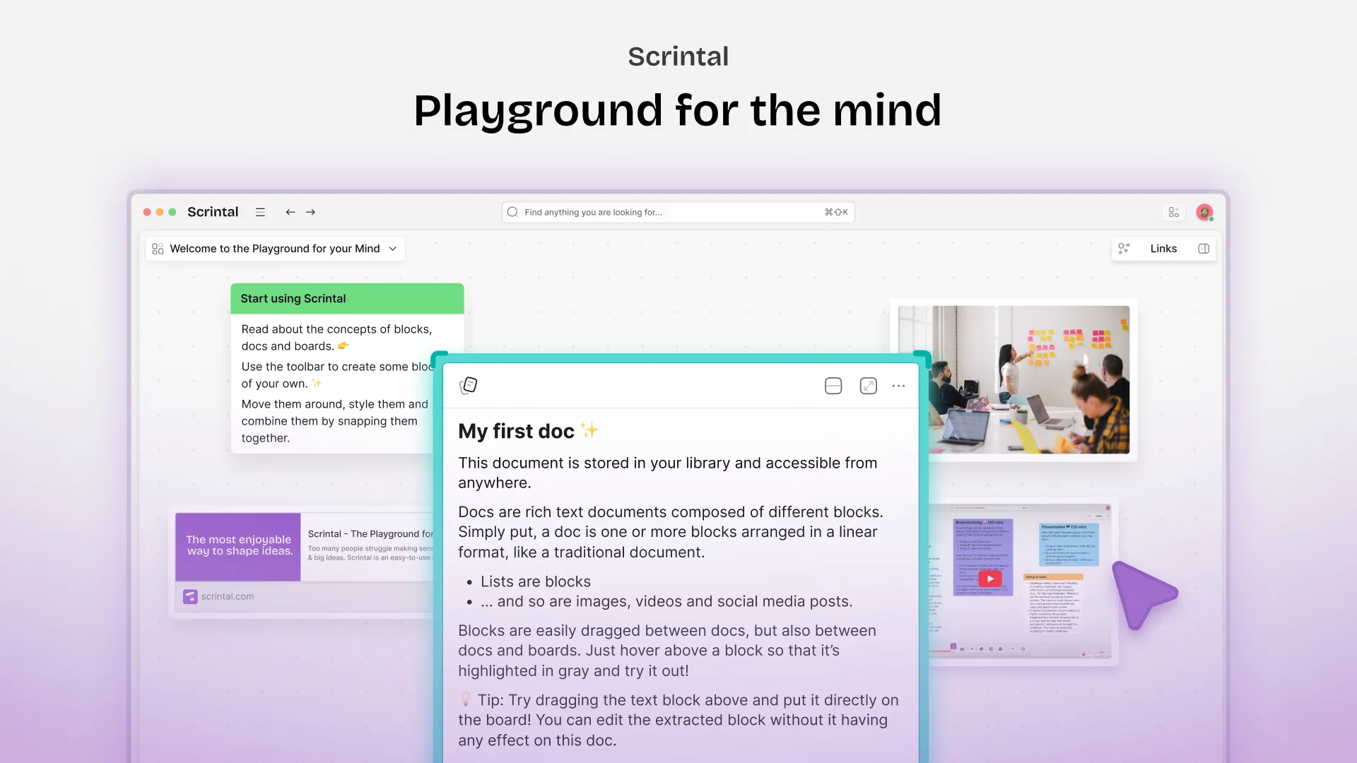
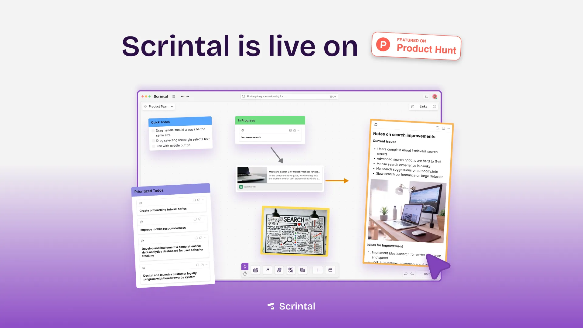
Scrintal's marketing has been spread across different social networks and channels. To communicate Scrintal's values across those channels, I created a variety of assets to showcase the product and new features. Within those assets, I leverage the preceding work I have done regarding colors, typography, and the logo, as well as the UI. Depending on the actual content of the asset, we either used gradient or solid backgrounds. When we showcased UI, we stylized some of the components to create eye-catching visuals.
I also created a variety of assets to accompany our Product Hunt Launch which aggregated over 150 comments and almost 1000 upvotes.
Website
To represent our changes in the product, the brand, and to accompany the launch of Scrintal, I built and designed a new website with Framer from the ground up. As with the other parts of the Scrintal brand, my goal with the new website was to incorporate the playful and bold character of Scrintal's brand. To achieve that, I used large and bold typography, gradient elements, and stylized components of Scrintal's UI. I combined that with fun and playful interactive elements like the navigation bar that shows different information based on the hover state, the draggable stylized blocks, or inline icons which we also used within the product.

Conclusion
Building a brand identity from the ground up was one of the wildest rides I experienced so far. Every single task I worked on meant leaving my comfort zone, but also gave me the opportunity to strengthen my skills. It was refreshing to get the chance to put my craft up for a challenge outside of the product design realm. I am proud how Scrintal's brand transformed and evolved.


